Marin Designers Showcase 2012- Let's Start the Show!
/ |
| The desk I designed especially for the Showcase was built for me by Puente Wood Products and the metal work is by George Rosenburger. The photograph, Intrepid II, is by James Bleecker. I selected this gorgeous photo because of the powerful image of the aircraft carrier and its relationship to the maritime theme of the space. I loved the sepia tone to the print, which was on watercolor paper, and the industrial quality to the subject. The time exposure to the image gives it a dreamlike quality as well. The lamp I selected reminded me of the Golden Gate Bridge and is by an amazing Canadian artist, Tahir Mahmood. I found the vintage fishing rods at the Sacramento Antique Faire. Photo by Peter Medilek |
I finally have had some time to sit down and go through all of the photos I have taken at the Marin Designer Showcase and get things ready to show to you all! I had professional photographer, Peter Medilek, take shots of the Guest Suite that I designed, so I am excited to start with these. It is so important to have work professionally photographed whenever possible. The lighting alone is worth everything. Many thanks to Peter for his beautiful work!
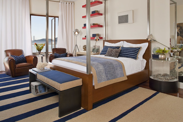 |
| I designed the area rug for the space in partnership with Savnik, and named it "Shorelines". The house is right on San Francisco Bay....you can even see a bit of the Golden Gate Bridge through the window. The blackened steel bench I designed was made for me by George Rosenburger. The mahogany and polished steel four poster bed is another KDI design, and produced by Dave Puente and George Rodsenburger. Dave also produced and installed the red wall shelves for me. Photo by Peter Medilek |
I had so much generous support from so many vendors, I want to thank them all. I could not have done the space without them. I designed much of the furniture in the space, as well as the area rug, so the project was especially detailed. I was on pins and needles for months waiting to see how all of the pieces were going to turn out! And they are beautiful.
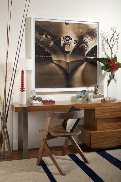 |
| The desk I designed is made of mahogany, like the floors in the space, and added to the stateroom feeling I was going for. I had the stainless steel support made and fitted into the desk top so the surface would be flush. The drawers are like independent boxes stacked on top of each other. The Beckett chair was generously provided by one of my favorite resources, Serena and Lily. Photo by Peter Medilek |
The Bed and the Desk were designs I came up with on paper when I did my initial presentation for the Showcase. It took more than a few meetings to make sure they turned out well. Dave Puente and George Rosenburger worked together to turn the vision into a working reality. Many many thanks to them both!
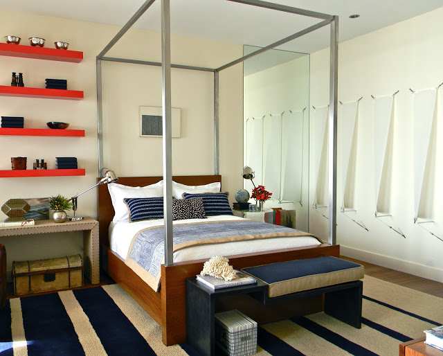 |
| The wall sculpture of sails, titled "Seven" by Stuart Allen, was provided by Jay Jay Gallery in Sacramento. I thought this piece was perfect for this "modern stateroom." Especially with the America's Cup Race fast approaching. I added the mirror to reflect the sculpture and create the appearance of a fleet of sails ready to race. Photo by Katie Denham |
The Showcase was also an opportunity to show some incredible art. Often times, art can be one of the last pieces completing a design puzzle, but here a designer has an opportunity to showcase art that may take awhile to find its place in a client's home. Art is such an important element in design. It makes a space unique and personal, which is really what a home should be. I was lucky to have galleries that were so very supportive to work with on this project!
Then there are also the details of the design. Here the bedding was something I wanted to be original and something one could not find anywhere else. The window treatment was also something I decided to have a bit of fun with. I had a curved wall to contend with, so came up with a creative solution there.
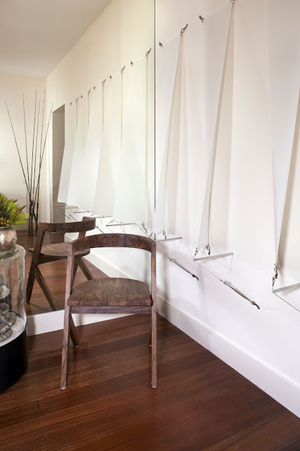 |
| A glass cylinder in the background is filled with vintage fishing rods. Full image of "Seven" by Stuart Allen. Photo by Peter Medilek |
Often, the details are the most fun things to see at a Showcase. The art, the detail on a pillow, the accessories and the lighting all come together to make a design interesting and unique. I like to gather things that are interesting and have a bit of humor. Adding a smile to one's day is an important thing, and I try to make that happen as often as possible!
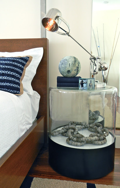 |
| I created a nightstand using an industrial glass vat with a blackened steel base. I added a tramp art chain made of bottle caps inside because everyone should have a bit of wackiness. The sphere on the table is a copper float that has a patina that reminds me of Jupiter. The lamps have an Art Deco vibe and were provided by Lumens Light and Living. Thank you Lumens! Photo by Katie Denham |
These photos show a few of those details that I had so much fun with. The foyer to the bedroom was fun little space I got to play with too. It was about 5'x5', and had three walls with doors, but it still became a space with impact. No space is too small to pay attention to....
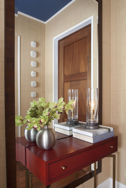 |
| Guest Suite Foyer with Natural Sisal Grasscloth Wallpaper. Mitchell Gold console provided by Ruby Living. Beautiful wall mirror made by the Mirror Gallery. Wall Sculptures by Heather Knight through Stephanie Breitbard Fine Arts. Photo by Peter Medilek |
So there you have it! I hope you all stay tuned to see all of the other amazing designs from all of the talented and creative designers who participated in this years Marin Designer Showcase! I have lots more to share.
Please come see everything in person if you can! There is nothing like seeing this beautiful home up close and personal. The views are breathtaking, and I have never seen a home for a Showcase with such presence.
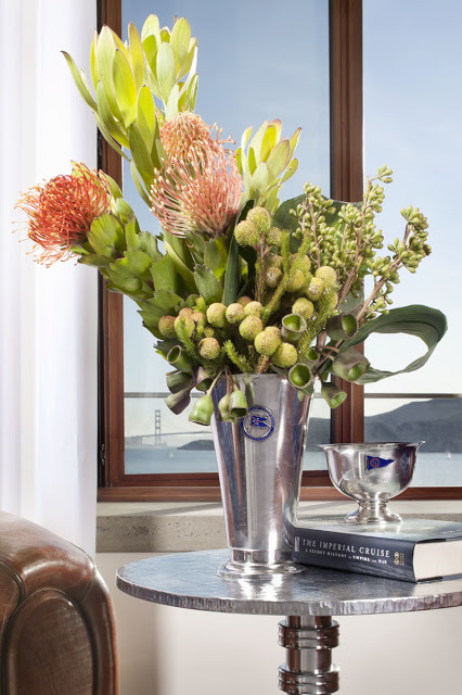 |
| Custom Designed Accent Table by Paul Benson. Flowers by Terri Jaffee Floral Design. Vintage 1920's French Smoking Chairs provided by William's Antiks. Photo by Peter Medilek |
For all of the details on paying a visit, hop on over to the Marin Designer Showcase website HERE.
