Holiday Give Away: Katie Ridder Rooms
/
There is never a better time of year to win a GIVE AWAY than the Holiday Season, is there? You can always use that extra gift for that special someone....or why not give yourself a gift? You deserve it!
One of my very favorite books this season is the bright and beautiful book showcasing the wealth of talent that is Katie Ridder. Author Heather Smith MacIsaac takes us into Katie Ridder ROOMS showing off Katie's creativity and daring use of color with abandon. Looking through the pages of this book is like eating your favorite dessert....oh, say a triple layer coconut cake or Laduree macaroons..... without ever thinking about the calories....delicious and decadent without the guilt.
Not only are the photos spectacular and large, but the graphic design of the book is so pretty as well. Each chapter is organized by room, and every title page sports a color illustration of a pattern found in one of Katie's charming wallpapers. The book begins with Entrances and Stair Halls. Katie says," More than a wow factor, I look for a delight factor when I design front halls." And shouldn't one be delighted every time one steps into a home?
 |
| This is Katie's own Entry Hall with its teal painted front door. |
I love design books. As a designer myself always on the search for inspiration, I will always go to a book organized in a way that is most useful. So I have great appreciation when a book is organized by room, or in any other logical reference friendly manner. Katie's book moves on to the Living Room next. Her philosophy about the Living sits as well with me as her style....." A living Room should be as enticing a place to read a book as it is to entertain. The room must have more than one use." So true....otherwise it may end up an unused space as families often migrate to the room where there is a television more often than not. The more uses a Living Room has, the more likely it will be enjoyed.
Katie shows photos of homes from East Coast to West including many photos of her own home, which I love! The one below is a Nantucket vacation home in lavender hues....a bit different than the expected blue.
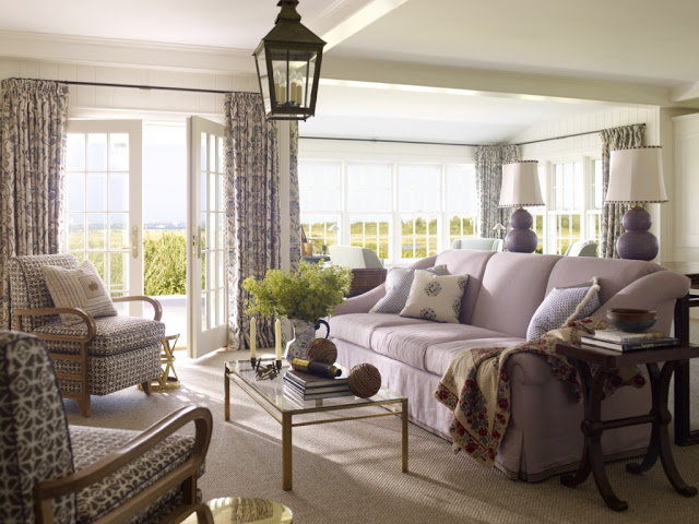 |
| Nantucket Living Room. |
The next chapter is devoted to Studies and Family Rooms. Katie says, " Family rooms should invite gathering and stand up to the accumulations that come with an active life". Amen! Perhaps I could use a little more help in that "accumulation" department. Any thought on piles of paper, overflowing magazines and homework, Katie? I never seem able to keep up. Katie always has a place for books, closed storage for hiding more "stuff", comfortable seating and good reading lighting.
 |
| Katie's Library with its Suzani covered sofa. |
Color and pattern are Katie's forte, and she uses these tools to create such cozy, fresh and inviting spaces. A great example is the sun room in this Arkansas home. Katie used Moroccan cement tiles to create a carpet effect
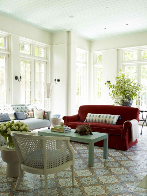 |
| Arkansas Sun Room |
Next up are the Dining Rooms. Katie divulges her secrets for the perfect Dining Room chair here....you will have to get the book to find out the secret either by winning the Give Away or buying the book for yourselves! Maybe you can figure out a few details by looking at these photos......
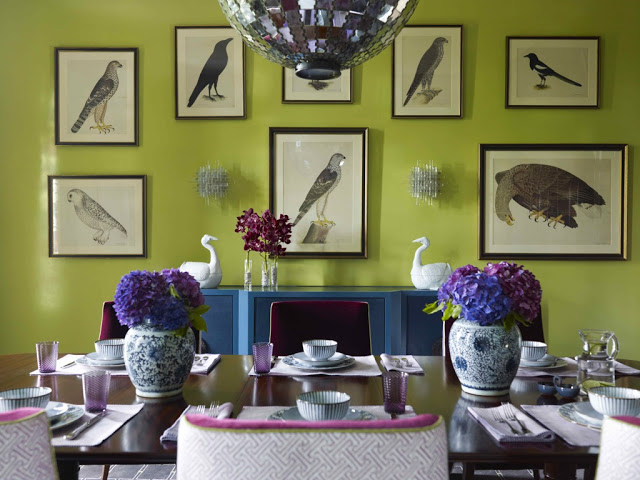 |
| Arkansas Dining Room where color perks up what can sometimes be an overlooked room. |
One thing her Dining Rooms are is luscious. The color overflows and you realize there is fun to be had here. Pass a little more wine please!
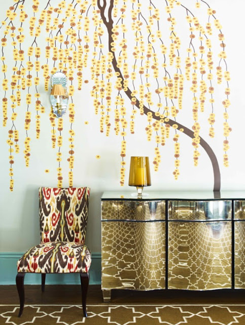 |
| Whimsical Weeping Willow and Ikat covered chairs dance beside a 1930'smirrored console. |
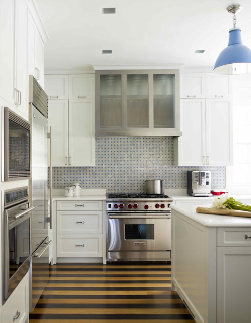
Kitchens are next, and there is always a little something extra over and above the no nonsense utility. In this kitchen, Katie stripes the wooden floor planks and added that pop of color on the light fixture....
And here, Katie used a green paint to highlight the window frames.....such a little thing, but it makes all the difference....
Now we head to the Bedrooms. So pretty..... so unique. I love them all. I will just have to have another house or two.....one can dream, no?
 |
| Beautiful wallpaper by Katie Ridder. She has been producing the papers since 2009. |
Every headboard is a custom creation and makes each room special. No two are alike....no identifiable retail beds here. I particularly like the pelmet edge detail in this teenager's room here.....
I wish I had images of some of the bathrooms to show you....you will just have to trust me....they are beautiful and full of wonderful wallpapers and the tile!
The book goes on to discuss the Details....lighting, upholstery, custom embroidery, tile, wallpapers (Katie's own designs), with many photos and design ideas. I feel like I am learning all o her secrets here!
Katie also shares her many sources for furnishings, fabrics, and all of the other treasures in these rooms.
Impressed yet?
So ....on to the GIVE AWAY!
1) Hop on over to the The Vendome Press and take a moment to look around. See the facebook link? Go ahead and "friend" them.
2) Become a follower on the katiedid blog by clicking the google friend connect button on the right. For those of you who subscribe through email, you only need to hop over to the website to see the sidebar.
3) Click on the "comment" link at the bottom of this post and leave a comment. I would love to hear your thoughts about Katie Ridder and her colorful style!
4) Make sure I can contact you by including an email address, or make sure your username has a link to a contact email.
5) The Cut Off date to enter is December 6th, at 5:00PM PST. I will announce the winner the next day, December 7th!
5) The Cut Off date to enter is December 6th, at 5:00PM PST. I will announce the winner the next day, December 7th!
GOOD LUCK
and, as always, thank you for reading!
All photos by Eric Piasecki, and in the spirit of full disclosure, many thanks to the generous folks at The Vendome Press for sending me this beautiful book!!!! I will treasure it.


