San Francisco Decorator Showcase 2010, Part V.... Jewel Box Spaces
/
Sometimes a smaller space might get overlooked in a Show House. At the San Francisco Decorator Showcase 2010, this couldn't be further from the truth! This Showcase puts the "Pow" in Powder Room! I wanted to show you some of the amazing things that can be done in smaller rooms that can make them oh so memorable!

Shower tile detail in the Modern Bath
Right off of the "Elemental Luxe" Room designed by Marion Philpotts-Miller and Jonathan Staub, there is a bathroom entitled "Modernism Talks Back". Designed by Gregg de Meza, this space certainly spoke to me! In the shower was a message that said "wash behind your ears" in mosaic tile....very graphic and so much fun. The mosaics seemed to spill out onto the floors under the vanity. I loved the fact that this room was quite modern, but the designer kept the original detailed arched opening...such a great contrast! Loved it. The art was chosen after the design was done....it was kismet. The swimmers depicted in dark watery charcoals and reflected yellows are perfect for the room!

"Modernism Talks Back"
Charles de Lisle was in charge of a small-ish sitting room which he cocooned in yards of shirred black and white gingham. Another room that was graphically witty.....cozy yet also modern.

Sitting Room
Charles has been on my radar for quite a long time. He thinks outside of the box and tends to be at the forefront of creative ideas which seem to catch on just as he is on to his next adventure in design. Be sure to check out his website HERE for a peek into this designer's mind at work.

Sitting Room
The splash of citron against the black, white and foggy grey adds a bit of jazz and pull the trees outside the window right in!
 Bathroom Vanity Details in Le Suite
Bathroom Vanity in Le Suite

Shower Details in Le Suite
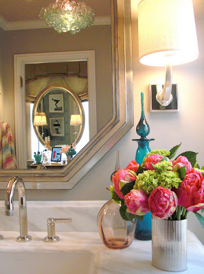
I think what I liked most was the vanity with the mirror placed before the window. All women know that natural light is best!
 Le Suite Dressing Room
This space was so well thought out, there is even an ipad with outfits catalogued and ready to go for any occasion! How smart is that?
 Vanity Details in Le Suite
Here are the clever pair, Goerge Brazil and Cicilia Sagara-Hill....very stylish themselves!
 George Brazil and Cecilia Sagrera-Hill
 Second Floor Kitchenette Details
 Anastasia Faiella


