Bathroom Analysis: Kara Mann
/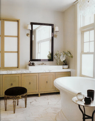
Metropolitan Home March 2009, Photo by Nathan Kirkman
Kara Mann, the Chicago based designer that has taken the design world by storm, has a spread in the latest Metropolitan Home. Ever since I saw her own home in Metropolitan home's May '07 issue, I have been a huge fan.
The home she designed for a young couple who bought a house in the Lakeview neighborhood of Chicago, is full of her edgy urban sensibility....but I have to say the Master Bath is what really caught my eye.
So what is it exactly about this space that is so "good"? I have been thinking about it, and have come up with a list:
- The use of a neutral color palette with high contrasts creates a much more dynamic space than shades of all one color. Examples here are the black fabric on the stool, the dark wood mirror and iron table used against a very light back round of white marble and very pale walls.
- The classic style of all elements and the contrasting use of contemporary or traditional pieces will transcend "trends" and help this bathroom keep it's style for many years. Examples here are the never "out" use of white marble, chrome plumbing fixtures, traditional moldings used in a very clean way, and white sink and tub. Even though the sink is very contemporary, it is also very simple and clean. This will help keep it current, unlike the typical vessel sinks that have been the trend through the early '00's.
- Mann's attention to detail is really wonderful. She has lined up the height of the counter perfectly with the wainscot. She has also hung the mirror at the same height as the cabinet to the left of the sink. There is a very nice balance of positive and negative space on the sink wall. This attention creates a sense of harmony without one even realizing why.
- Mann has also not tried to match every finish. She has used different metals and wood finishes to create a much more interesting space. I don't think one has to match everything...and much prefer the "unmatched" quality here. The faucet is chrome or polished nickel , as are the sconces. She has also introduced an antique brass metal on the stool and the cabinet hardware. And then there is the oil rubbed bronze or steel on the table. And there are two wood finishes as well: the cerused oak cabinets and the dark wood mirror frame. A much more interesting mix!
- I like the cleanliness of no window treatment in a bath. It seems so much more soothing with Mann's use of obscure glass for window privacy, which she echoes in the milk glass in the wall cabinet.
- Speaking of the wall cabinet..it is a very nice alternative to the typical medicine cabinet. The glass gives a feeling of more spaciousness, while hiding toiletries away neatly.
- Mann's adds interesting accents like the stool, the crystal vase and other black accessories on the table next to the bath, and little perfume tray and the variegated plant, all a bit unusual and very nicely contrasted.
- The light fixtures are very well done as well. The sconces are clean and classic: a modern take on a traditional form. The fixture above the bath is white and adds to the light neutral back round while adding needed texture.
- Then there is always the white marble. It is always beautiful!
That is my take on the "why" this bathroom appeals so much. Kara Mann continues to turn out great design every time. Be sure to checkout the latest issue of Met Home to see the rest of the house. You will not be sorry! I would love to hear your thoughts!