San Francisco Decorator Showcase 2010, Part II
/
Dining Room by Tucker and Marks Design
The San Francisco Decorator Showcase is in full swing after the opening weekend, and it is as wonderful as we have all come to expect. In my last post, I gave you a peek into the Living Room designed by David Kensington and Powder Room by Matthew Turner.
Today, a peek into the softly elegant Dining Room designed by Suzanne Tucker of Tucker and Marks Design. The pretty and soothing color palette makes one feel immediately at home. One could stay here for hours in the cozy dining chairs, an original design called the Matchstick Chair, soon to be added to the Suzanne Tucker Home furniture line. 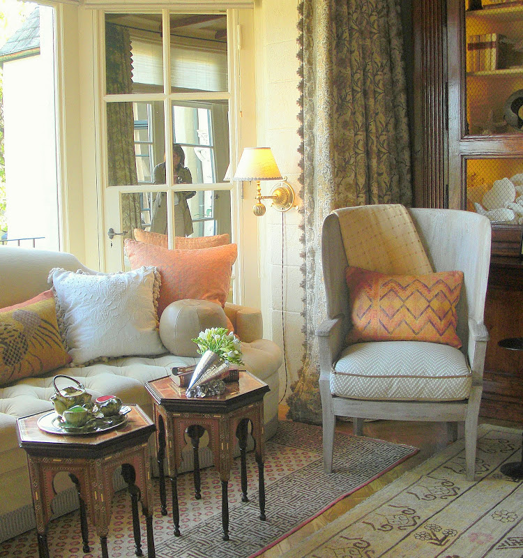

The bay window is conducive to curling up with a good book and a cup of tea. This Dining Room really gets it right with it's multifunctional attitude. Rooms this beautiful deserve to be used more often than once a day don't they? The 18th century French Oak bibliotheque, diverse, plush seating arrangements, and dry bar make this space alluring at any time of day.
 Tucker and Marks is all about the details. The table settings showed just how perfectly adept they are at making every detail count. I loved the various shades of amethyst, aubergine, and wine on the Hurricane , succulent centerpiece, crystal and sea urchin shells. Delicious!
 The detail work on the Dining Room Matchstick Chairs was also exquisite. The fabric is by Holland and Sherry with a custom embroidered back panel and tufted seats. Gorgeous!
 The drapery panels fabricated by Susan Chastaine are made from a Suzanne Tucker fabric which was custom dyed for the Showcase. I believe it will be added permanently to her line, as it should be! It is brilliant. The border that is printed on the selvage edge of the fabric was cut and reapplied as a border on the leading edge and mitered across the bottom. There was also a small border on the other side, as well as a beautifully subtle taupe gingham cotton lining. The fringe was a casual jute loop and was the perfect accent. Details, details!
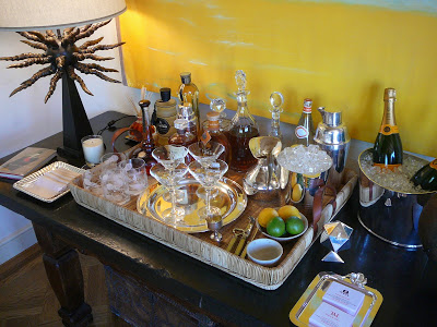 And what deserves just as much attention as anything else? Why....the bar! The casual console was festively turned out with all of the essentials, and accented with the "Horny" bronze lamp from Blackman Cruz (didn't I tell you they show up all over the place?!)
 Suzanne Tucker with Christopher Roy, one of her designers at Tucker and Marks
Designers Christopher Roy and Suzanne Tucker, as elegant and approachable as the lovely room they designed.
From the Dining Room, we headed to the Kitchen, which was designed by the design duo of Jennifer Hershon and Joann Harltey. Did I like it? YES! They combined different wood tones and paint colors is such an original way. It was modern and at the same time befitted a traditional home so well with it's rustic metal accents and freestanding range.
 I loved the custom shelving above the island, the thick Caesarstone counter tops, and the stainless farmhouse sink.
 The combination of wood cabinetry mixed with the putty colored painted cabinets was unpredictable and very cool.
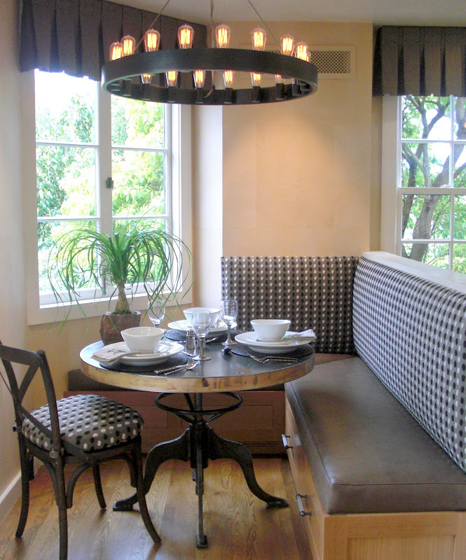
The cozy nook was tucked away next to a servant's staircase. As small as it was, it still held plenty of seating and extra storage under the banquette. Loved the vintage table base and the metal chandelier.
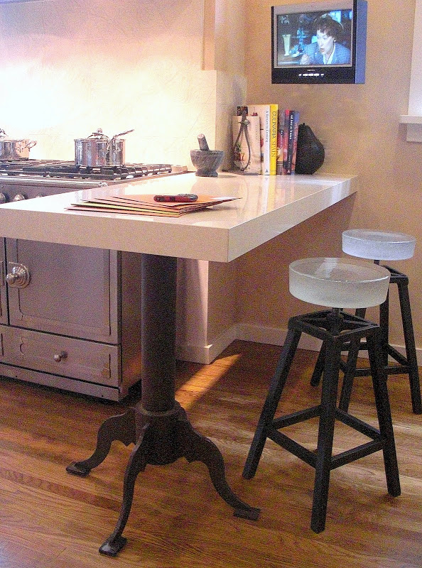
The bar next to the range had a custom made pedestal that was designed to compliment the nook table base. The stools are by Gulassa and have solid glass seats....truly breathtaking.
 And here they are, the dynamic duo, Joann Hartley and Jennifer Hershon. The ladies are as cool as the spaces they design. Check them out HERE.
Truly....there are so many outstanding spaces at this year's Showcase, don't miss it if you are in the area. Click HERE for more information about tickets and hours and special events.


