Showcase House at the Adamsleigh Estate with Traditional Home
 |
| First, thank you all for your very polite patience! It has taken me way too long to show you everything I have been up to lately! My trip to North Carolina was jam packed full of interior design inspiration, and one of the most inspiring bits was the gorgeous Show House at the Adamsleigh Estate benefiting the Junior League of Greensboro with the National Media Sponsor, Traditional Home. |
There was a brilliant line-up of top designers involved with the Show House....some of my very favorites! Some of the main rooms were done in partnership with some of the largest furniture manufacturers from High Point.
First up is the Living Room which was designed by
Miles Redd in partnership with
Century Furniture. Miles has said that every room needs "a little bit of blue", and in this space he has included a beautiful array of blues: turquoise, sky blue, denim blue, navy, royal blue and teal. Mixed with shots of chocolate and persimmon, the palette is decidedly appetizing! As always, I love his mix of traditional and modern, and Century Furniture provided plenty of options for the mix......
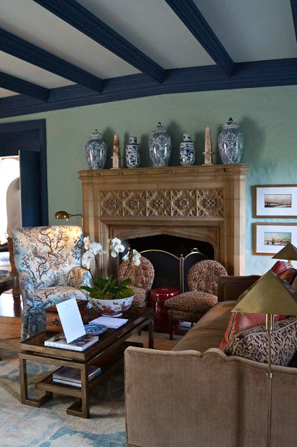 |
| My favorite thing in this room has got to be the area rug! Enormous and just exquisite.... |

Another of my favorite designers is
Eric Cohler. Eric worked with
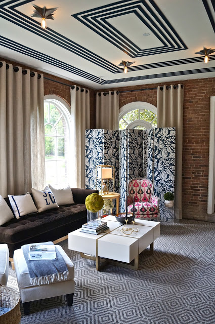
Pearson to produce a fresh and fun Sun Porch. Eric brought a lot of punch to this space with bold graphic pattern and unexpected details. One of the most fun details in the space was the striped border pattern on the ceiling topped off with the star burst light fixtures. What a great way to add instant architectural detail to the space! Also fun is the fabric covered screen, the grommeted drapery panels and the graphic area rug.
Eric seems to have such a fine tuned instinct for putting fabrics, colors and textures together that are so unexpected and yet work so well. This is one of my favorite spaces in the home....just so bright, comfortable and interesting....
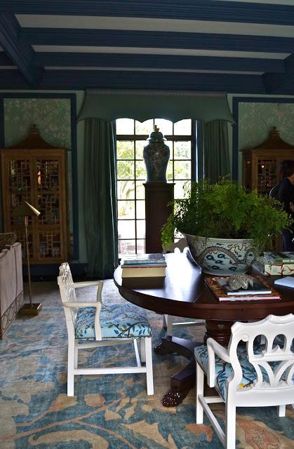
Next up is the Sun Room. Yes, that is right....this house is so large that it has a Sun Porch AND a Sun Room. (Honestly, I did end up inadvertently missing a couple of major rooms in the house before time ran out and we had to leave! Can you imagine missing the Kitchen and Dining Room?!) So...the Sun Room was designed by
Bradshaw Orrell and
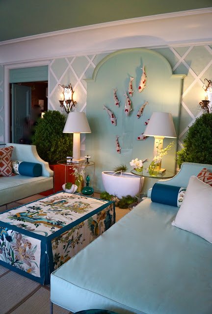
Randy McManus. It is just the place for a rest on the divan, martini in hand. Cool turquoise washes the walls and white lattice recalls a pretty garden....
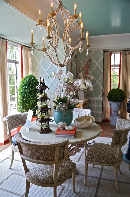
Coral pops is way into the scheme here and there, and you can really see the beautiful sheen on the ceiling....
Suzanne Kasler partnered with
Hickory Chair (more of Hickory Chair and their latest offerings to come!) to create a cozy sophisticated Den. Again, that graphic pattern keeps things lively in an otherwise serene and peaceful space...
The light fixture echoes the area rug motif perfectly! Suzanne is another design celeb, and another one of my favorites! It was great to be able to see top designers' work in person!
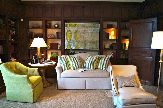
Next up is the Library, a space designed by Greensboro's own
Ann Legette. Ann brightened up the wood paneled space with cheerful watercolored blues and greens and ivory upholstery. The curtains were a custom hand-dyed silk, and don't you love the tracery ceiling?.....
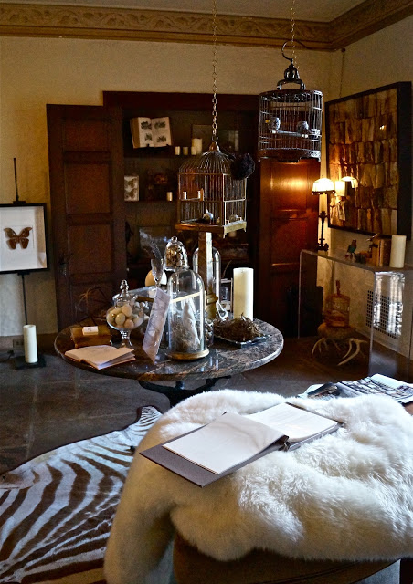
I was thoroughly charmed by the Front Foyer space designed by
Jane Matteson. It was full of collected curiosities, vintage bird cages and bird nests, mechanical birds and butterfly and moth specimens. A naturalist's refuge.....
I loved the antique book art pieces that just enhance the fantasy of an era gone by.....
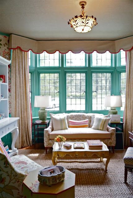
I had such fun meeting the
Madcap Cottage duo, John Locke and Jason Oliver who were so charming in showing me the Breakfast Room space they designed.....
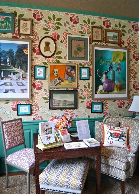
John and Oliver have a talent for mixing patterns and colors in such a fun "madcap" way. i would just love to stay in this space and have tea, and just gab an afternoon away with these two! I hope you all click on over
HERE to visit Madcap Cottage and see all of the pillows they have designed! (Again...so much to share on these two fellows coming up!)
One of the things I loved most about this room was that John and Oliver kept the original flower motifs painted on the door above and worked them into their design. They have that appreciation of vintage treasures and how we can work them into our homes in a fresh way. Bravo!
You can see one their pillows in the chair below, which just happens to have their signature elephant on the front....
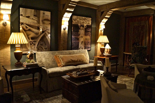
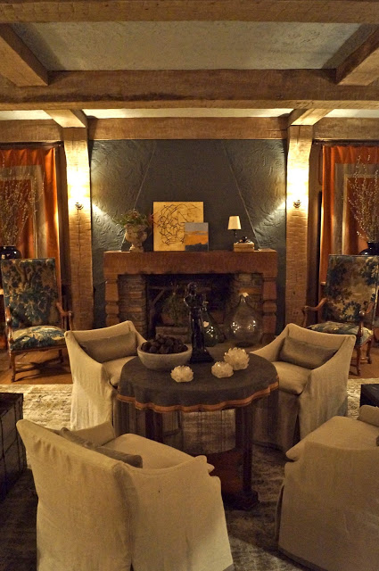
Our last stop today is what is being called the "Prohibition Room". My guess is that this is where the imbibing went on, and perhaps where the hooch was stored during those roaring 20's! It was located below decks...in the basement. Patrick Lewis and Cindy Smith of
Circa Interiors worked with
Lee Industries to transform the space into a cozy retreat....where perhaps one could imagine a seance being held...
Can you feel the free-wheeling ghosts of the Great Gatsby era congregating here for a cocktail?...
Honestly, this home was so large, I truly did not have time to finish the whole tour! I cannot believe I missed the Kitchen and Dining Room.....but that is what happened. I almost missed the shuttle for the trip back to High Point! However, I still have LOTS to show you in my next post. There is a whole second floor to go through, so I hope you are ready for more amazing design in the days to come!
OFr more information about the Showhouse, click on over
HERE!
Have a beautiful day!

