Curiouser and Curiouser, The San Francisco Decorator Showcase, and GIVE AWAY WINNER!
There is little I am more fascinated with than a collector's habitat. There is something about the stories of things and how they are accumulated that intrigues me. The arrangement says as much a bout a person as the things themselves. It is a very personal gathering and a creative spirit that makes for a space that is pleasingly artful as opposed to a cluttered mess (as is often the case in the recesses of rooms where I spend less time in my own home. There are rooms I just stuff full of the odds and ends and shut the door!)
At the
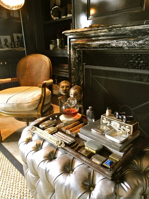
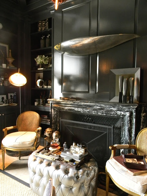
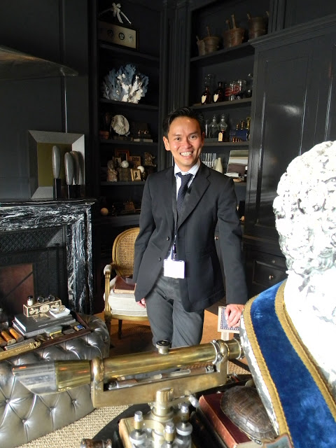
San Francisco Decorator Showcase, there were a few rooms that captured my imagination: who would live here and where did they find all of the treasures?! The first room was titled "The Collector's Library", designed by
Jonathan Rachman. The designer loves to collect and he has graciously shared his treasures with us.
Perhaps the perfect place for gentleman....or ladies? to enjoy a bit of brandy by the fire....
Jonathan mounted the tip of an airplane wing above the fireplace. It almost looks like a deep sea fish trophy at first glance. The shape of the trio of sculptures on the mantle echo the color and shape.....
The industrial edge of the light fixtures and the table base are a nice counterpoint to the high lacquer paint and French antique furniture....
For another fantastic article about this space and the very talented Mr. Rachman, check out The Style Saloniste
HERE.
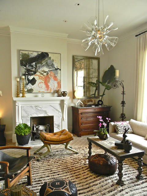
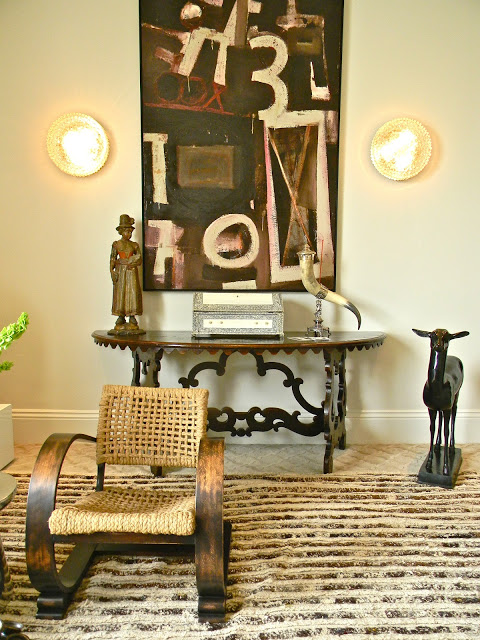
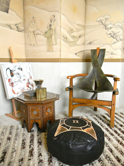
Matthew has put together what he calls a room inspired by music, whether it be a drum circle or a CD. Music is the constant that brings all cultures together. Matthew has successfully brought different cultures together in this space using furnishings and objects from all over the world...high and low, old and new.....he has even designed the pendant light using vases he found for a song.
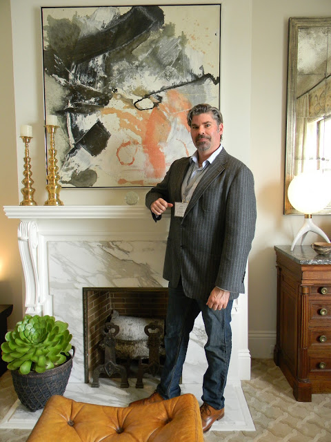
Matthew has a talent for assembling a great mix of interesting pieces! The hoofed ottoman, statue, inlaid table, art and even the succulent plant next to the fireplace all are so different, but work together so well! The secret? The neutral colors unify it all.
I would have been happy to walk away with any of the things in this space!
And here is the designer,
Matthew Maccaul Turner, as nice as he is talented...
Perhaps the most eye popping space was the Bathroom adjacent to the previous space. You may remember
THIS blog post about
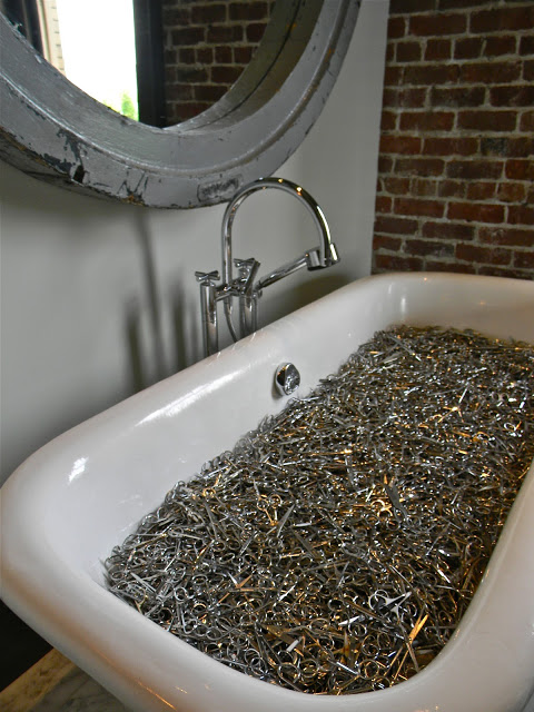
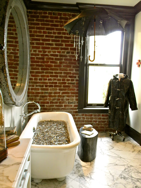
Ma(i)sonry in Yountville, the brain child of Michael Polenske. Michael has taken his talent on the road installing an art "happening" in this stately bathroom at the Showcase. With the help of Carissa Duncan, Michael assembled strange and very curious things in this space. There is a Hitchcock-esque story here....perhaps you can imagine it all yourselves......
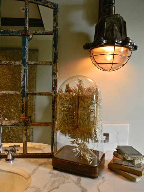
Yes,, the tub was full of scissors confiscated at the airport. And industrial lights become sconces at the vanity.....
Artworks by Michele Pred (Umbrella with scissors titled
Travelers) and Greg Lauren ( oil on paper raincoat title
Toggle) were placed in the space along with a huge mirror framed in a huge round window frame. All are available at
Ma(i)sonry....
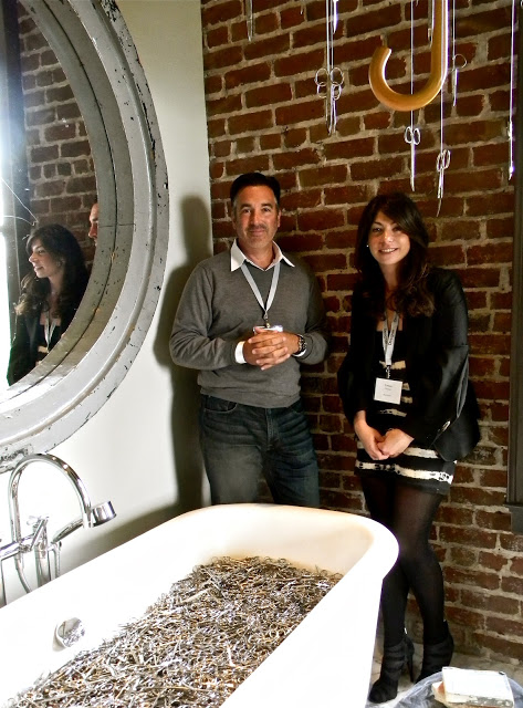
The visionaries of Ma(i)sonry, Michael Polenske and Carissa Duncan...
The San Francisco Showcase was superb this year. Sadly, is over for this year, but stay tuned! I will be posting more photos in the days to come.
*******************
Next,
We have a winner for the
GIVE AWAY for the Playful Home book by Andrew Weaving. The folks at Rizzoli have kindly offered a copy to a katiedid reader .......
And the winner is:
Pamela Terry
author of one of my very favorite blogs,
I hope you have a chance to visit Pamela and Edward and read her exquisitely written musings!
Congratulations Pamela!

