 |
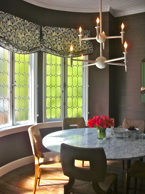
| Kitchen Nook by Tish Key. Chairs by Hollywood at Home, Almond Hatzog Dining Table, Borgeoise Boheme Chandelier, Donghia Wall covering, Katie Leed and Company Roman Shade Fabric (love!) |
The
San Francisco Decorator Showcase is going strong until the end of May, so I am giving you all another peek!
This time....it's the Kitchen, a Cookbook Nook, and adjoining Powder Room. When I was at the house, the designers all had "before" pictures of the house, and let me say, the transformations are amazing. The Kitchen Design is by
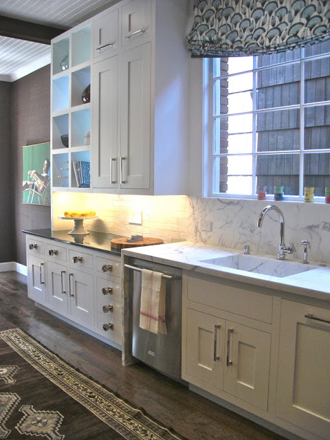
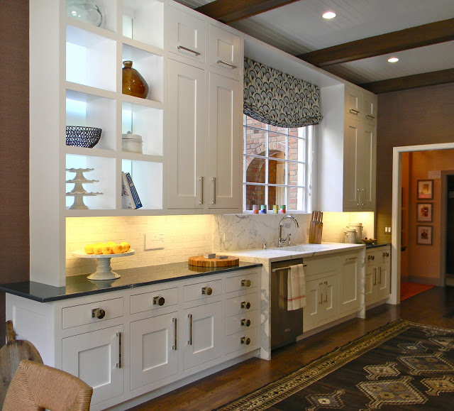
Tish Key Interior Design, Inc. Tish took a dreary and dark 70's kitchen space and made it into a bright and fresh space with a twist to traditional styling.
Tish opened up a window previously covered up to let in more light. You can see the light coming through the open shelving to the left of the sink. She used a white marble counter around the sink and French lava stone (available from
Sue Fisher King) in a gorgeous navy blue for the rest of the counters on either side of the sink. Notice that the sink area is slightly higher than the rest of the counters....great look.
In another stroke of genius, Tish used door knobs from
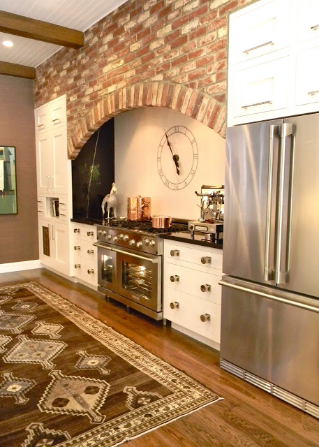
Baldwin as over scaled hardware on the cabinets. Loved that! The original brick was kept over the range, and Tish used black marble with white veining for the counter tops. The back splash tile (
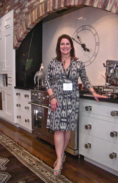
Waterworks) included a large clock made out of tile....so cool.
Tish was on hand to talk to me about all of the great ideas and resources she used for this kitchen. Gracious and so talented, it was a pleasure!
Adjacent tot he Kitchen was what was previously a small hallway, transformed into a jewel box of a space by
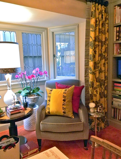
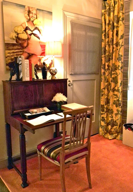
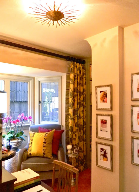
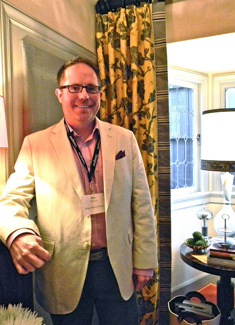
Brian Dittmar. Brian calls this space the Cookbook Nook. I think I would be spending many an hour here in this cozy chair perusing my books, watching a little TV, or googling recipes at the antique writing desk.
Brian took inspiration from a recent trip to Paris where he sampled as many pastel hued macaroons as possible. Brian used a beautiful silvery grass cloth by
Phillip Jeffries as the backdrop to the delicious macaroon colors used in the curtain panels and pillows.
You can even see photos of those inspiring bits of confection gracing the walls in the Cookbook Nook. Other favorite things in this space include the
Circa Lighting ceiling fixture, the accent tables, and art above the Swedish Art Deco desk.
I think my favorite part of the space was Brian himself. Dressed to the nines, Brian even sported gorgeous tangerine socks which matched the area rug. It's all in the details, and Brian is a master.
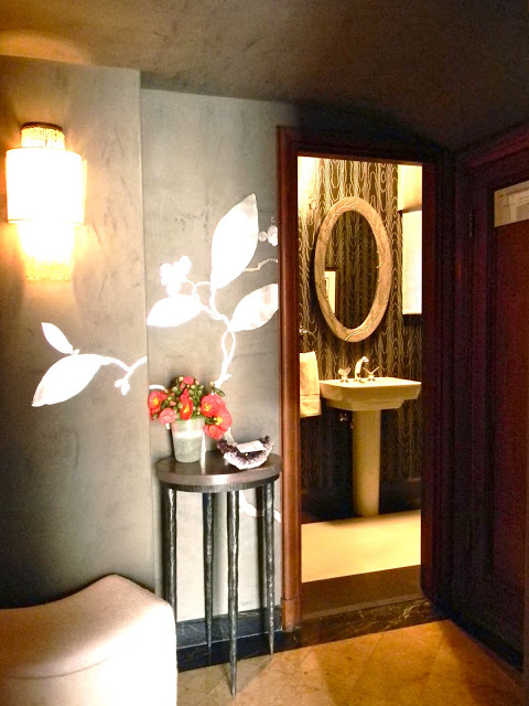
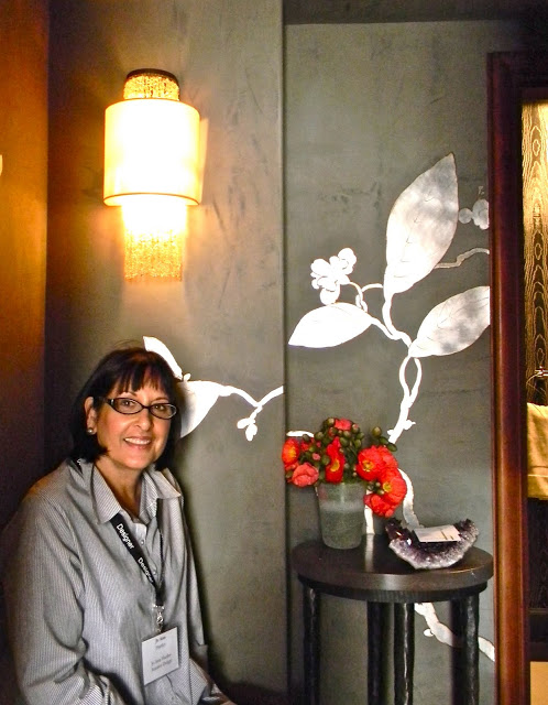
Just off of the Cookbook Nook was a glamorously moody Powder Room designed by
Jo Ann Hartley. Dramatic wall treatments by
Linda Horning and hand screened Moire wallpaper by
Robert Crowder provide the "wow" factor in this space, with accents like
Phillip Nimmo sconces
Maitland Smith accent table, and Plum Branch mirror by
Deborah Childress finishing things off with panache.
Again, I felt lucky to get to meet the designers and hear all about their inspiration and all of the wonderful artisans they pulled together to create such brilliant spaces. Jo Anne was no exception! Thanks Jo Ann!
I hope you all have a chance to visit the
San Francisco Decorator Showcase this year. 2011 is a very good year!
Moving upstairs next...lots of surprises in store!
