Modern by Design Showhouse III: Level Two
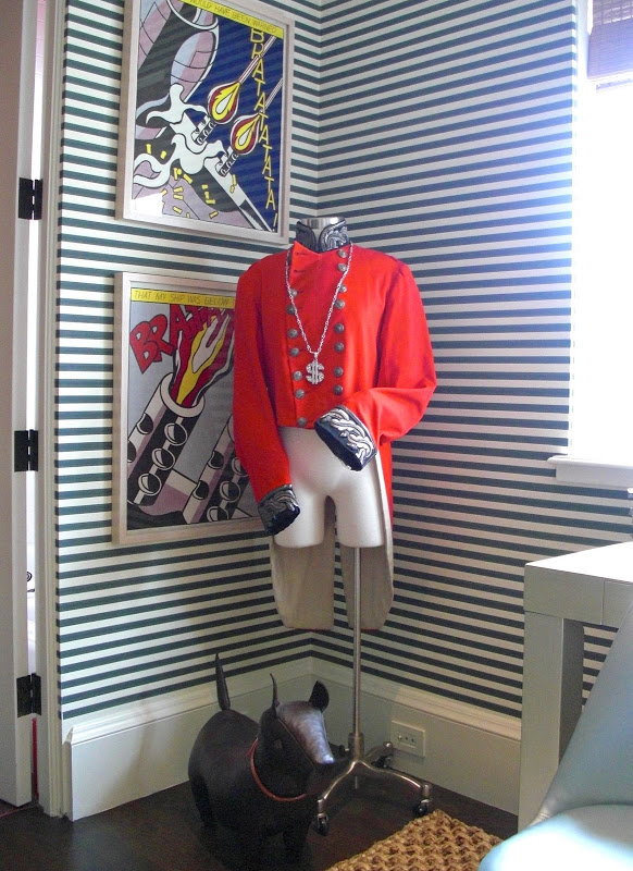
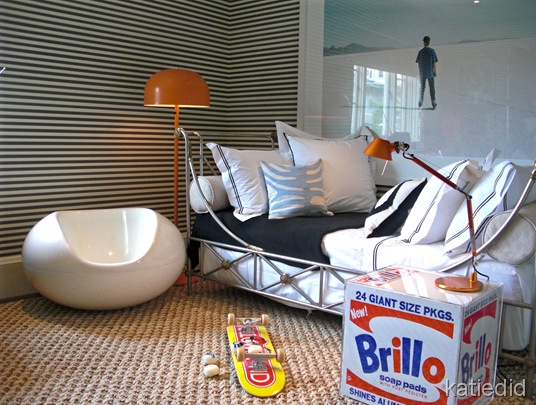
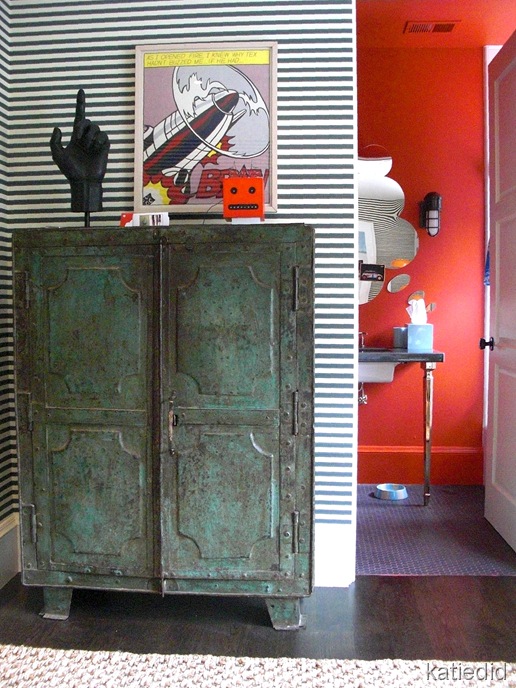
I love this French industrial iron cabinet from Epoca. The way everything works together here: the dark green wall paper stripe (Kneedler Faucher), the texture of the rug, The orange light fixtures, the graphic wall art, and one-of-a-kind finds like this cabinet takes an artistic eye, and a bold confidence. Martha Angus has these attributes in spades.
The bathroom design is by Philip Parton who worked with Martha to create a space that works perfectly with the bedroom. Note the inexpensive black chicken wire floor tile is grouted with red grout. Nice and inexpensive way to jazz it up! I love how he painted the whole space red, ceiling included, and how the mirror works so well with the bedroom art.
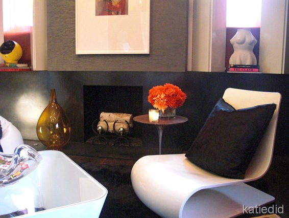
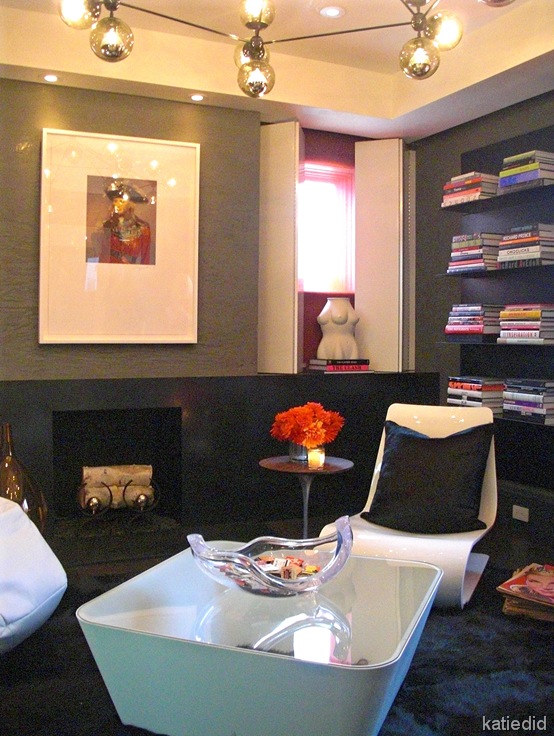
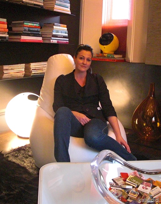
Martha Angus studied at the Ecole Des Beaux Arts and Carnegie Mellon, going on to do projects for Ralph Lauren, Giorgio Armani and the Lauder family. She brings a fine arts approach to her work mixing modern and antique with finesse and style.Nicole sourced the “Como” goatskin area rug from The Rug Company and customized the ceiling fixture from Jason Miller Studio. The custom white shutters are a brilliant answer to treat these windows above the fireplace mantle.
This room has a sort of “James Bond” allure and a “Groovy Baby” chic factor that had me smiling . It was quite the hang out at the Showhouse Gala. People didn’t want to leave…so the party just kept getting bigger in here until it was wall to wall people.
Nice work Nicole. Very nice!
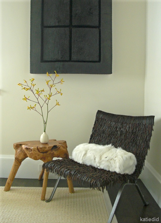
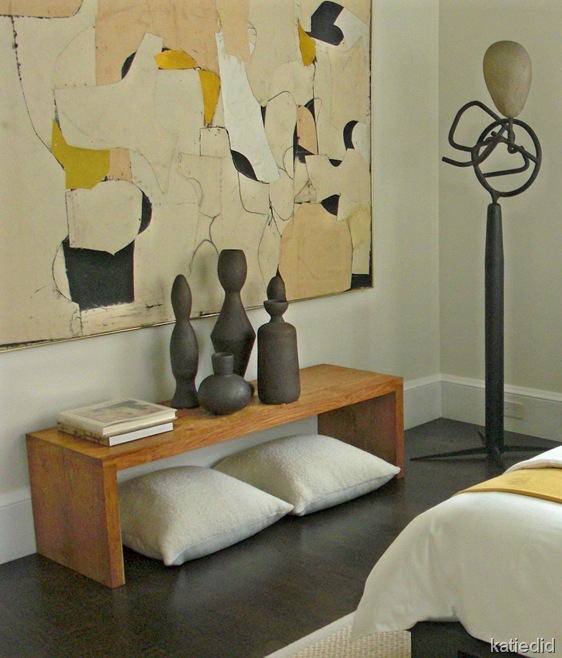
The Guest Room was designed by Dowling Kimm Studios. Julie Dowling and Lorissa Kimm joined forces in 2001 after both having had stints at Princeton earning degrees in Architecture and both having worked in the offices of Michael Graves.
They have put together a soothing retreat here focusing on comfort and the arts. A serene palette and organically modern furniture set the tone for rest and relaxation.
We made it to the Master Bedroom after much “oohhing and aahhing”, and met up with designer Gary Hutton for even more. Gary was amazing. He had such interesting stories behind each and every design choice that we were glued to the room. We were literally asked to move along to the next room so the next press group could come through. I won’t be able to recount all of the stories, but here are a few of them.
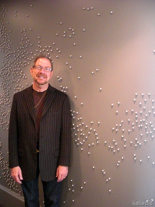
We entered the space along a narrow hallway that most people would just hang art on and call it a day. But Gary has a mind that reaches beyond us mere mortals. See all the “dots” on the wall? (Well, actually Swarovski “pearls”) Kind of an interesting random placement. Very artistic and all. But then Gary told us they represent all of the seismic activity throughout North America. You can see Mexico there by his right hand.
Gary Hutton, Designer
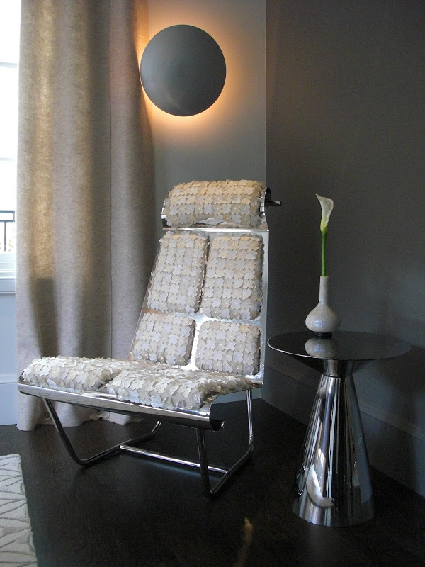
Gary was such a great host in his space. He created much of the furniture and sounded like he was having the best time doing everything. This chair is one of his designs. I like the contrast between the slick metal and the textured flower petal fabric.. The fabric used for the drapery panels is made from 100% recycled soda bottles and was VERY affordable! It looks just like felted wool.
The Master Bedroom was sleek and modern, but very comfortable as well. The “wow” factor came in with the Artemide light fixture that slowly changed colors. I caught it on it’s pink cycle. When turned off, it looks like silver mylar.
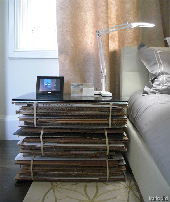
Notice the nightstands: See the very well-known Frank Geary cardboard nesting tables on the right? Originally Gary had intended to use matching night tables. But another set could not be found in time.
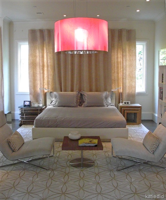
Here is where chutzpah in a a designer really pays off. Gary decided to make his own cardboard table. And the story doesn’t stop there. He told us that he came in the room when the workmen were still touching up paint, and one of them was standing on his creation paint brush in hand(the glass top had not been added yet). The workman had understandably thought it was a pile of trash. (We were laughing so hard at Gary’s telling of the story, I think we scared off a couple of people.)
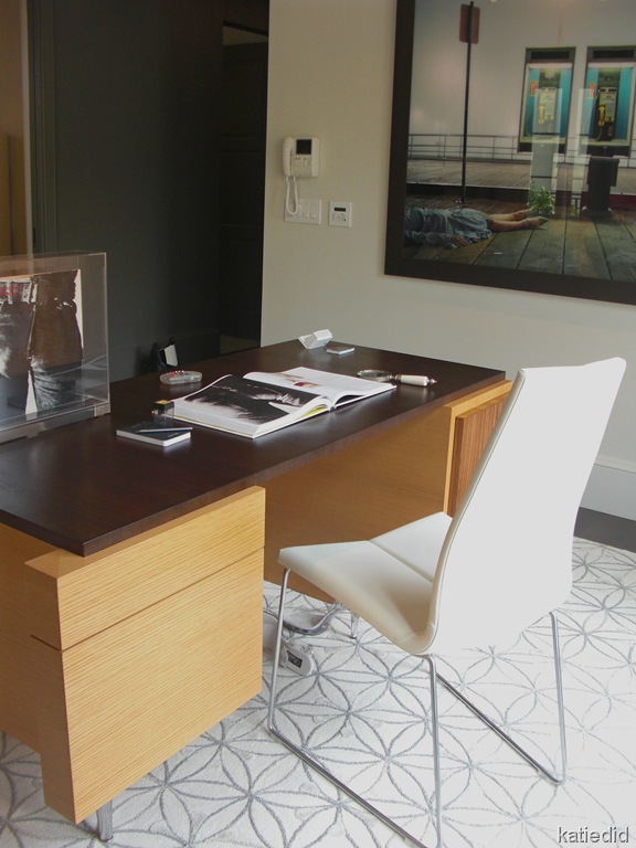
Gary designed the desk in the study, and you can just make out the size twelve Lucite stiletto's under it. Another story there.
The art photograph is called “High Fashion Crime Scene”, one of a series by Melanie Pullen. If only she hadn’t been wearing those Prada pumps, she might have made it to the phone in time.
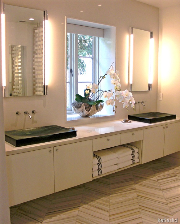
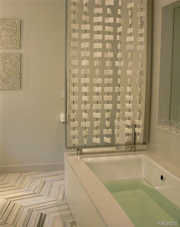
Mr. Hutton also designed the Master Bath using Walker Zanger floor tile (gorgeous, no?), Kohler glass vessel sinks and WoodMode Cabinets. Sleek and sophisticated.
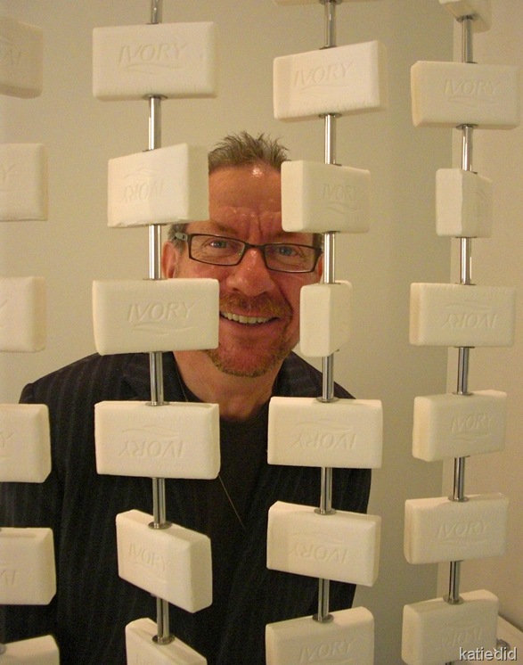
Gary created a custom screen to divide the bath from the toilet area. Quite handsome I think. Go on….look a little closer….
HAHAhaha! SOoo CLEAN and modern ….and it smells good too! Now do you understand why we had a hard time leaving?
Next up: Top Level with the Jay Jeffers and his “Sophisticated Fun”, a Min Day Bathroom, and gardens by Surfacedesign and styled by Throwing Rock Studio.
