Modern by Design Showhouse 2009: Last Stop
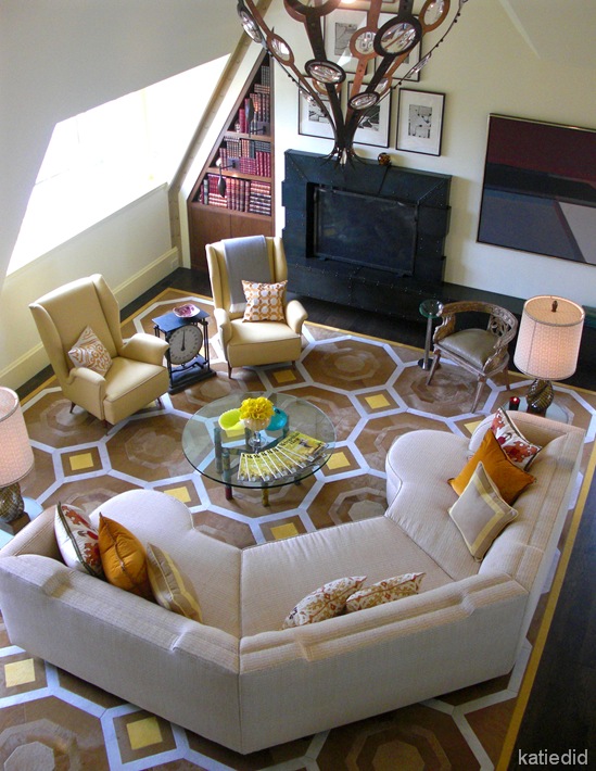
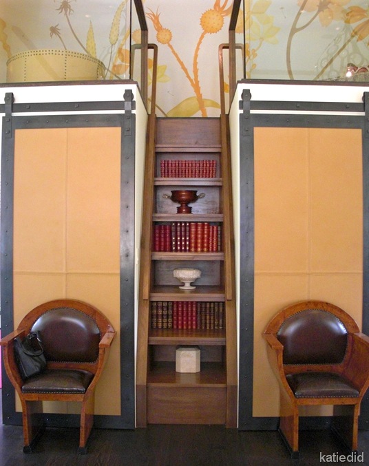
The Top Floor of the Modern by Design Showhouse was a show stopper! At the top of the stairs was the large Family Room designed by that purveyor of “Sophisticated Fun”, Jay Jeffers. Jay has been noted in House Beautiful’s Top 100 and has graced the pages of Metropolitan Home and Elle Decor numerous times.
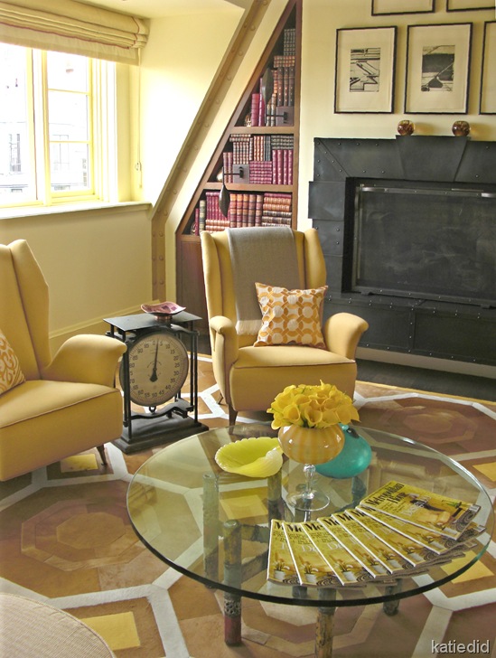
His room for this Showhouse shows off his talents yet again. A sunshine-y color palette makes you feel immediately upbeat, and there was an abundance of great ideas.
Remember that sofa back? Well, it is echoed again in the design of the fireplace surround. And I loved the side table between the chairs: a vintage scale from Coup d’etat.
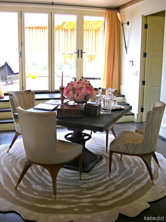
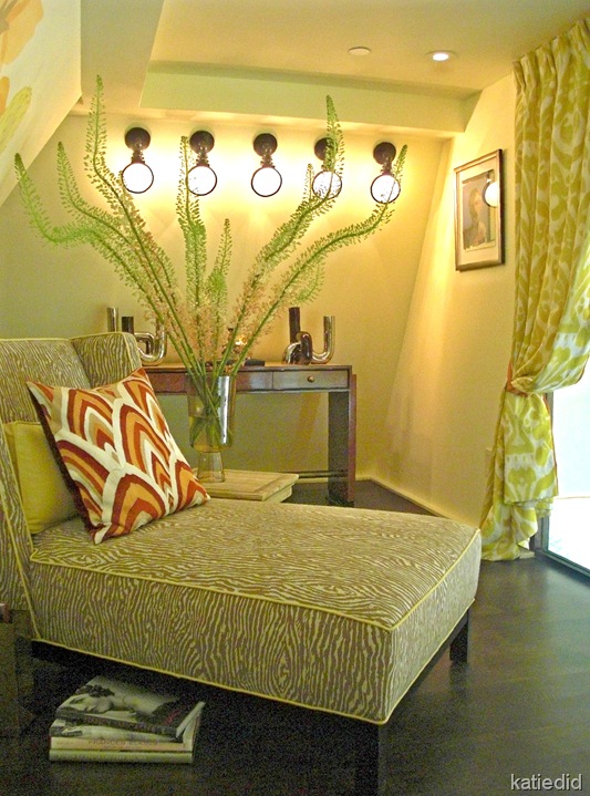
Jay put in a couple of seating areas in this loft space. Kind of a fun little hideaway! Fun faux wood grain fabric on the chaise is from Dogwood Fabrics. And the Ikat fabric on the drape is from Belfour. Interesting lighting idea: lining up a series of spyglass sconces from Circa Lighting. I have never seen this done before.
There was so much here to see, I could not capture it all! You will just have to come in person!
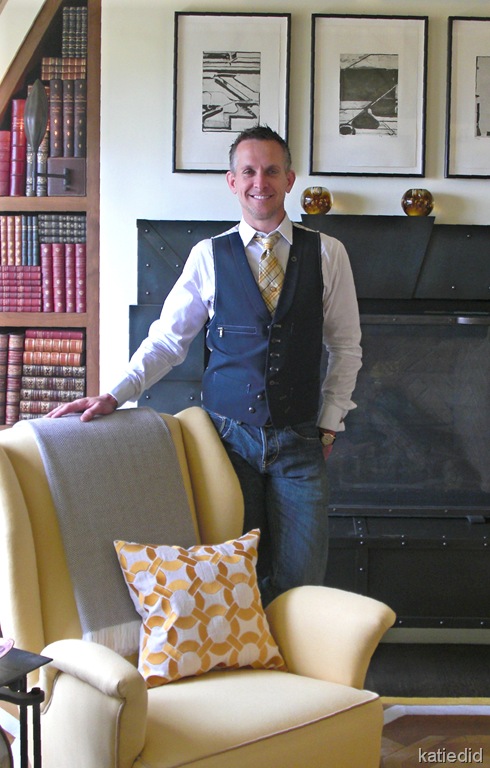 Jay Jeffers, Jeffers Design Group
Jay was so gracious and quite dapper in this picture, I think. His tie fits in perfectly with the scheme. He was so fun to talk to and had so many fantastic ideas in this room!
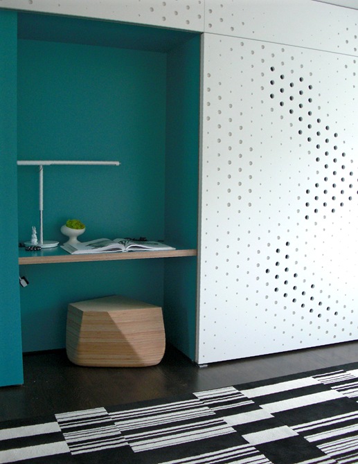
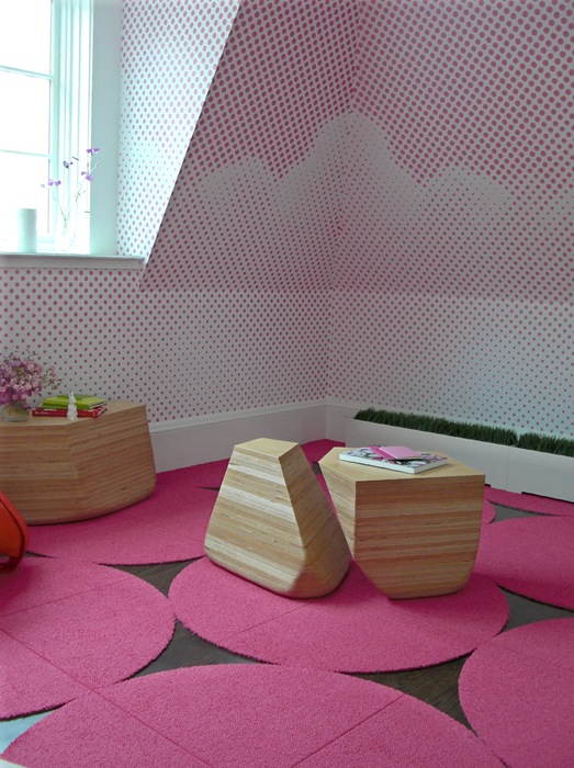
There were two “his and hers” bedrooms off of the Family Room designed by the architectural partnership of Min Day. E.B. Min and Jeffrey L. Day created duel spaces that are young and fresh. They designed a pierced panel closet door in a sort of wave pattern that hides a Murphy bed. Nicely set off by the blue green desk area. Fun carpet tile by FLOR. Wood stool designed by Min Day.
In the “girl’s” room, the dot idea was carried out with paint stenciled in a cloud pattern. Really a great idea for a child’s room! More “dots” on the floor (FLOR carpet tile)
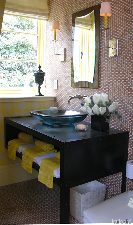
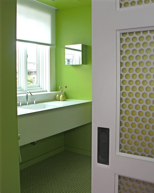
The bathroom was an “ode to green” with it’s apple green paint and glass tile (Walker Zanger) Happy and striking in it’s monochromatic palette.
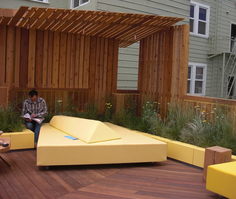
But there is more outside!!! Surfacedesign is the genius behind the outside spaces. This first space is the rooftop terrace which was decked in an angled pattern and furnished with soft “sculpture”.
The downstairs patio was a study in black and white. There was modern wood paneling installed as sculpture and stained black Throwing Rock Studio created the concrete pads and bench. The white strips in the concrete are LED lights that glow with a blue light at night. Quite stunning.
The space had a very liveable quality but at the same time was a sort of interactive art piece in and of itself. Quite beautiful.
The birdbath was formed out of the end of the bench. It reminded me of Indian grinding rocks filled with rain water.
And one of the talents behind Surfacedesign is principal Roderick Wyllie who was on hand to chat about the landscape design and his company. Do check out the Surfacedesign website to see more genius at work.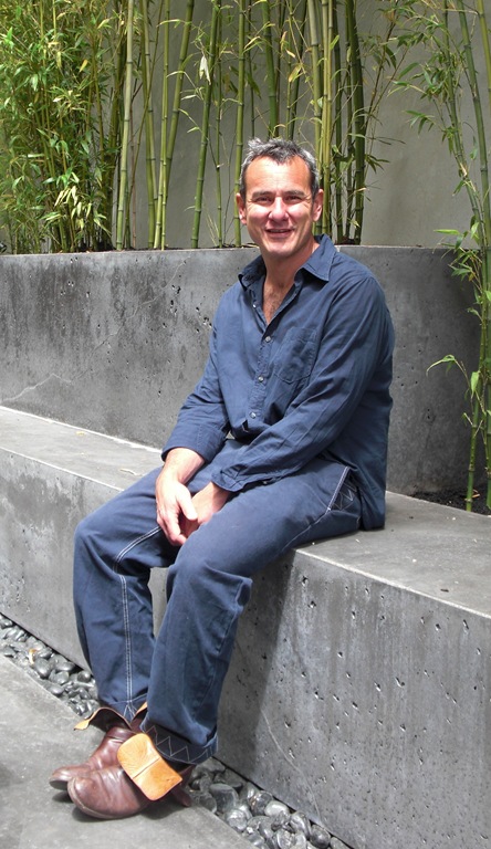 Roderick Wyllie, Surfacedesign
I hope you have a chance to get over to the Modern by Design Showhouse this weekend….the last weekend BTW! There is so much I was not able to show you (my little camera can only do so much!) And so much more you really should see!
I wanted to thank all of the designers I was able to meet for being such great hosts in the very hectic hours before the opening Gala. It was truly a pleasure meeting them all. As varied as their styles are, there were clearly traits common to them all. They are all passionate about what they do every day, and the enthusiasm for the clients with whom they work is palpable. It was inspiring to see their designs….but perhaps even more inspiring to see the kind of people they are: really interested in the world and the people in it.
(And a special thanks to Cheminne Taylor-Smith of Metropolitan Home!)

