Modern by Design 2009 Showhouse II: Going Up!
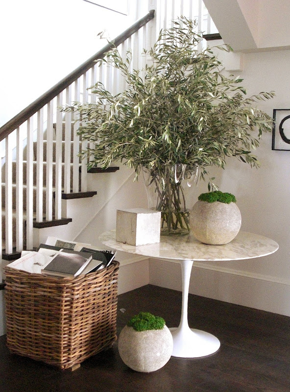
When we entered the Modern by Design 2009 Showhouse, we were greeted by a fresh, yet classic, Foyer designed by Greg Stewart and David Oldroyd of the esteemed design firm, Orlando Diaz-Azcuy Associates. The simple concrete spheres and classic Saarinen table contrast beautifully with the dark hardwood floors. And you can do no wrong in my eyes when you use olive branches on an entry table.
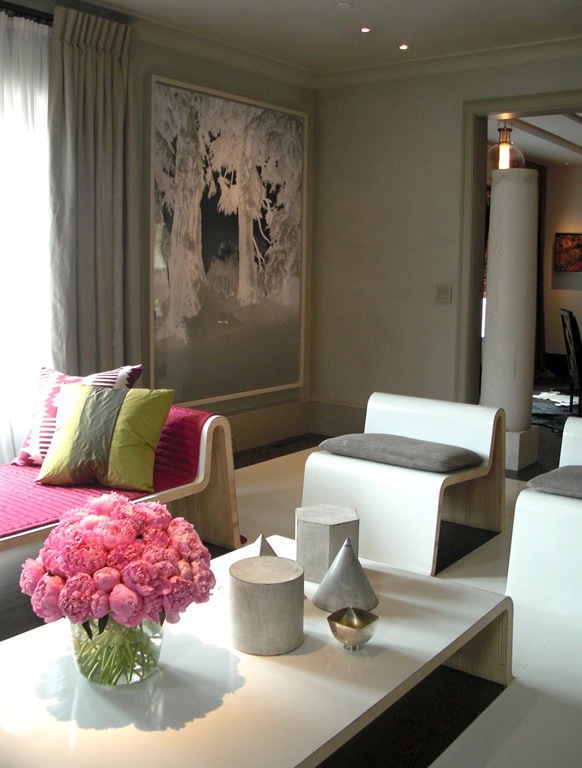
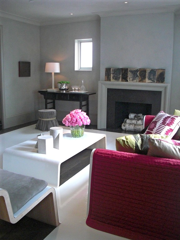
The soft grey walls were plastered with a lime and marble aggregate to provide an aged look in contrast to the slicker modern furniture. I love the pop of the pink fabrics and peonies with that hazy grey. Love the Madeline Weinrib Ikat Pillows and vintage zinc architectural drafting forms.
I loved the joyful serenity in this room. Can those two adjectives be found in the same space? Clearly. In this shot you can really see how the furniture rises up out of the floor covering. This space is really an experiment with furniture and their qualities as sculptural forms. Even if this is “not your thing” the playfulness is something you have to appreciate.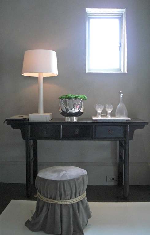
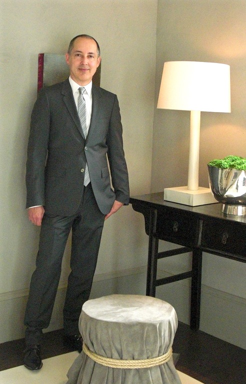
Greg was so nice to talk with me about the space. I was just fascinated about how they constructed the furniture. He and David designed it all and had Plant Architectural Woodwork fabricate it from reclaimed plywood from a former jobsite. They then had Eco Vinyl Flooring from Lonseal laid over it all. So cool!
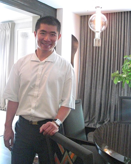
The Dining Room was our next stop where we had the chance to meet the designer Jiun Ho. Jiun is a well respected designer, as well as a furniture and lighting designer. The JIUN HO Collection includes furniture, lighting by Boyd and area rugs.
The Dining Room boasts Dining Table and Chair designs by Jiun. The insert “fabric” in the backs of the chairs is really a custom cowhide design pieced together by Kyle Bunting Rugs. Just another example of why Jiun is such a creative force.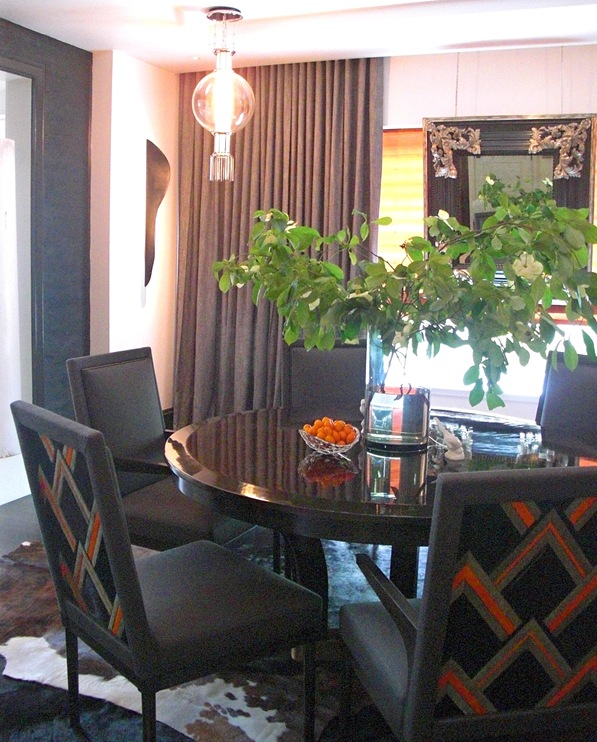
Jiun Ho also selected light fixtures from the Jonathon Browning Studios, Inc. and placed them in an unexpected way: He put four fixtures in the corners of the room instead of one larger fixture in the center. They seem like modern adaptations of Asian paper lanterns.
Jiun layered cowhides on the floor in alternating black and brown colors creating a larger rounded shape for the room. Juin also applied dark stained sandblasted wood paneling to two opposing sides of the room which added so much depth and warmth. It is all of these details that takes a room from ordinary to extraordinary.
Jiun Ho
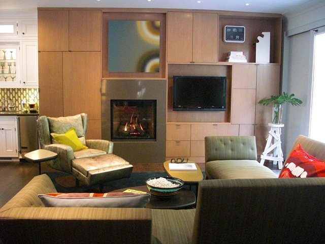
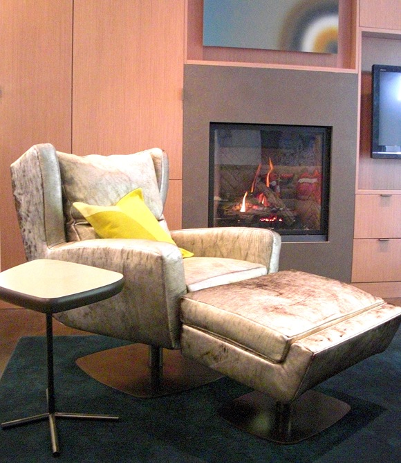
The Family Room and Kitchen were the creations of the stellar Steve Miller. When I met Steve, he exuded such an upbeat force. I can see why he is such a success. Steve worked with furniture maker Ted Boerner in the design of the custom sectional and swivel chair. There was much thought put into the sofa and how people would sit in it: whether to watch TV or to look out onto the patio outside. You can see that the chaise portion is made so one can sit either way. Oh! And I love the Vivienne Westwood Pillows from The Rug Company on the sofa!
Steve worked with WoodMode Cabinets in the design of the media and fireplace wall. Modern and functional, warm and stylish, I think it captures the young spirit of an active family that might live here.
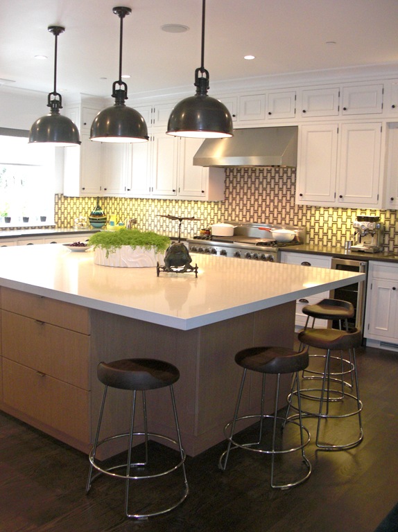
The kitchen was also done by Steve Miller, and there is alot to love here. The backsplash tile is a mosaic by Walker Zanger, who has just been putting out the most beautiful stuff lately. The counters are Caesarstone, and Cabinets by WoodMode. Steve used traditional styled cabinets around the perimeter and a more contemporary style for the island. An interesting, and successful combination I think. Love the light fixtures by Circa Lighting as well. And the McGuire stools! I would not have thought they were from McGuire….they are freshening up their line!
Next up: Level Two!
