Upstairs Downstairs at the San Francisco Decorator Showcase
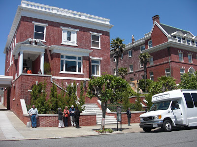
Last Thursday I drove to San Francisco to see the 2009 Decorator Showcase. The day was just perfect....blue skies and a bit of an ocean breeze. It promised to be a perfect day. We arrived right around noon, so we had the whole afternoon to take our time and enjoy everything. The house, built in 1910, is located in what is referred to as "the most fashionable" part of Pacific Heights. It was built as a twin in the Georgian style by architect Nathaniel Blaisdell. The Showcase occupied the twin on the left.
I have to stay what struck me as we climbed the steps to the front door were the steps themselves. They were finished in white marble and were in perfect conditon....well...as perfect as they could be at almost 100 years old.
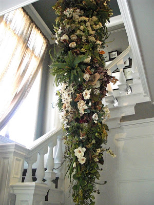
We entered the front door and were greeted by this whimsical floral arrangement that extended from the entry level all the way up to the ceiling of the next floor. It was quite a statement and drew our attention to the beautiful balustrade. We discovered it was created by artist Yedda Morrison
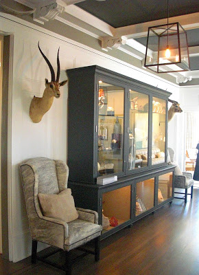
The Entry, Staircase and Upper Hallway were designed by Nicole Hollis. She used an abundance of Natural Curiosities in her design which she set off with a rich grey paint color on the ceiling and on the cabinet housing the items.
I love the striking contrast between the white trim and grey paint colors as the backdrop for the natural colors of the objects in the case and the soft grey of the hide upholstered chairs.
I am glad the hall was so interesting, or I would have passed it right by to get to the Living Room which was designed by one of my favorite designers: Myra Hoefer. She has an incredible talent for creating rooms that are both relaxed and elegant.
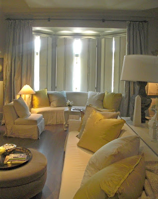
I was just lucky to catch this image showing a dreamy quality with the sun's rays coming through the window. Myra had created shutters that were upholstered with what looked like white leather with nail head trim. There were beautiful ivory linen covered sofas with generously scaled silk covered pillows in soft grey and a citron-y gold.
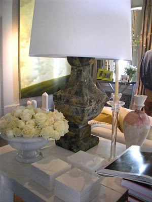
When I saw this John Dickinson table, I swooned a little. (I heard it is for sale by the way.....for so much more than I could afford, I am afraid I have forgotten the amount!)
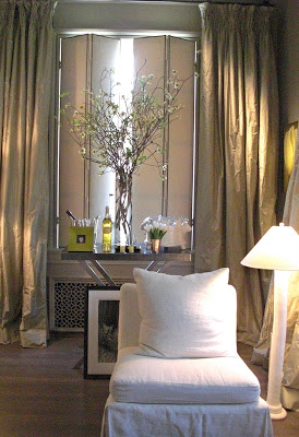
The color palette was just so beautiful....again the soft grey silk taffeta for the drapery panels and ivory linen slipper chairs.
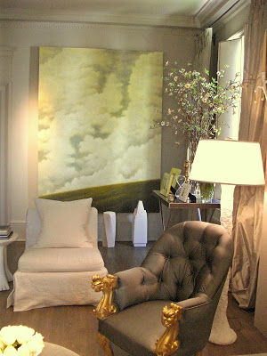
The sconces above the fireplace caught my eye: handmade white plaster made in France. They flank and large antique gold framed mirror. Myra is a master at scale I think.
There were two paintings and a few original sculptures by Wade Hoefer. There was so much more in this room that my poor little camera could not adequately capture....you will just have to see for yourself!
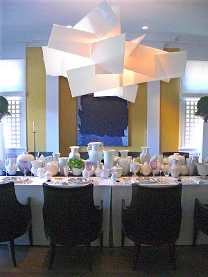
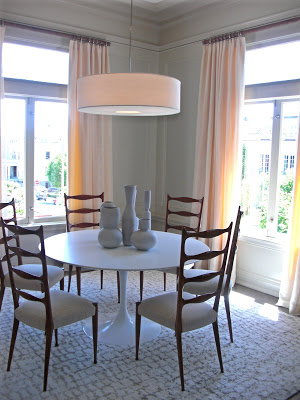
The Dining Room was adjacent to the Living Room, and was designed by another design great, Orlando Diaz-Azcuy. Of course, the first thing that caught our eye was the very dramatic "Big Bang' chandelier from Limn. An amazing focal point to be sure. The designer used this piece as a very "today" solution " showing confidence, rather than the aspiration shown by using a copy of a traditional chandelier, as is commonly done." I think it was quite successfully used. (I also overheard it is for sale as well!....any takers?)
The Dining Chairs are also a Diaz-Azcuy design for McGuire Furniture.
We seemed to recognize many of the items in the beautiful collection of white running down the table. We asked the docent, and yes....many are from the personal collection of Mr. Diaz-Azcuy.
This table was one of my favorite things in the Showcase. The flatware is a Diaz-Azcuy design, and the violet stemware is beautifully mismatched and are set off against the white vases. They are also part of the designer's own collection. I love how the dinner plates, with their traditional black and white pattern, contrast with the caviar dishes...a simple rectangle of glass with it's own glass spoon.
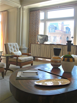
The Family Room and Breakfast Room were designed by the very talented Matthew Leverone. There were so many things I loved about this room: the amazing coffee table....
The cozy ottomans...
The beautiful and graphic console in front of the windows....just to name a few. I great combination of really interesting furniture pieces grounded with a calm and serene color palette.
The Breakfast Room by the same designer had a very appealing sculptural quality...again very serene in it's simplicity. I was quite taken with these two rooms!
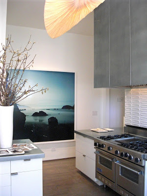
By this time, I was"catching" the uniting element from room to room. There was a recurrence of soft foggy greys mixed with a warm golden glow. The Kitchen presented this palette through the use of zinc for the counter tops and custom hood, and the beautiful light fixture floating like a sun kissed cloud. (The Liana S. Pendant by Aqua Creations)
I do have a "thing" for the Heath Ceramics tile above the range I must admit.
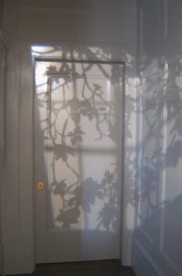
I thought this was such a clever way to create some drama in an otherwise ordinary small hallway. It look like there is a window right across from this door, right? Well you would be wrong. It was a custom light filter (gobo) shining a window mullion and tree leaf pattern on this foggy grey door.
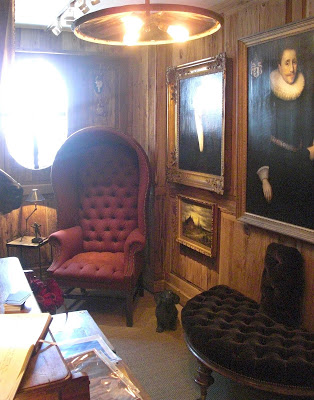
This house has four levels....so we decided to head down to the lower level. Not sure what to expect, we ended up finding a perfect small jewel of a space designed by Darin Geise of the fabulous shop, Coup D'Etat. It measured all of 8 feet wide, but was packed with atmosphere.
It was fully paneled in what appeared to be reclaimed barn wood....a wonderful backdrop to the Renaissance Portraits and tufted upholstery. My photo of the pendant light did not do it justice I am afraid.
The perfect little hideout for reading...perhaps Jane Austin....ok....War and Peace?
Another little space with it's fair share of personality was the Vintner's Vault designed by Michelle Wempe of Zumaooh.
We were tempted....we really were.
With Four Floors of packed with design inspiration, this first installment has covered the "Downstairs" levels. There are quite a few rooms that my camera could not adequately capture. So, if you are in the Bay Area, I hope you have a chance to visit the Showcase! It is truly well worth your attention. This Memorial Day Weekend is the last weekend! Tickets are available at the door. For more inforamtion, please click here.
On Monday, I will take you "Upstairs" for more glamourous interiors!
