Rizzoli Book Sneak Peek: Orlando Diaz-Azcuy
One of the things that makes me excited to go to work in the morning is the prospect of pouring over my treasured design books for inspiration and information. When I was informed that another top notch design book by the esteemed and very chic author, Diane Dorrans Saeks was in the works, and that it was about an architect and designer that I have much admired for many years....well....I barely had the patience to wait for a copy.
Orlando Diaz-Azcuy is a treasured California architect...at least I think of him as our very own, even though he has projects all over the world and is originally from Cuba. Mr. Diaz-Azcuy was born and raised in Pinar del Rio, Cuba until the political climate made it more prudent for his parents to send him to study architecture at Catholic University in Washington D.C.. After graduating, he high-tailed it to Northern California where he has been ever since. Living in San Francisco, Mr Diaz-Azcuy travels often abroad and very often to New York, where he also keeps an office, working and developing his designer's eye.
Photo: Tim Street Porter
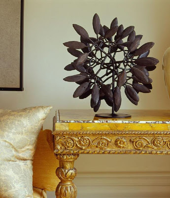
In an Edwardian house in San Francisco, Mr. Diaz-Azcuy placed a graphic sculpture by Harry Bertoia on a gilded marble-top Italian table, showing each to advantage. - Diane Dorrans Saeks
You may know Mr. Diaz-Azcuy as a superb Architect and Designer, but he is also the creator of multiple beautiful lines of furniture for McGuire, Light fixtures for Boyd Lighting, and fabric lines for Schumacher and Pallas Textiles. You will see many of his product designs in the photos here.
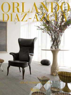
I imagine Mr. Diaz-Azcuy has used the residences he has had over the years as laboratories for his creations and ideas. The book cover is a case in point. Mr. Diaz-Azcuy (ODA) creates a certain tension in the placement of his collected furniture pieces in his Pacific Heights modern apartment. In this very modern space, he has placed a 1930's leather chair by Danish designer Fritz Henningsen as if it were a piece of sculpture. You can see one of his sconces designed for Boyd next to the very moody painting.
Photo: David Duncan Livingston
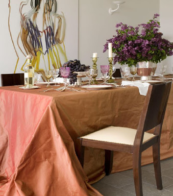
In the Dining Room, ODA drapes the table with silk taffeta and tops it with antique Venetian crystal and silverware from Gumps. Quite a departure for what one would call a contemporary apartment. But that very thing is what makes it interesting. The successful contrast between new and old...the interjection of the unexpected. That is what sets a "great" designer apart from the merely "good".
Photo: Grey Crawford
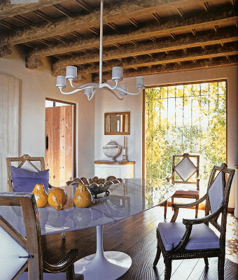
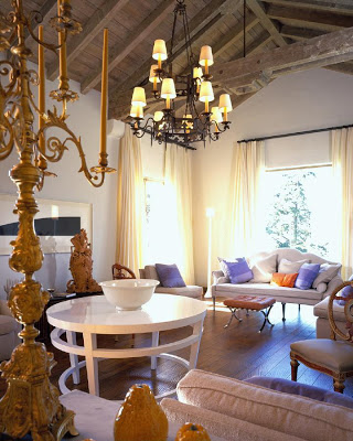
ODA's house in St. Francis Wood, a 1930's Spanish colonial with Pacific Ocean views, reminded him of the house he grew up in, in Havana Cuba. In this home, ODA reversed his contrast of new/old. He started with a traditonal shell and took the opportunity to fill it with modern furnishings. In the dining room you will find one of 11 Saarinen tables ODA has collected over the years. The chandelier is one designed by ODA for Boyd. He has surrounded the table with George II gilded chairs providing luxury and that "surprising contrast" that is his hallmark.
Photo: Matthew Millman
The Living Room is again a mix of old an new. The white lacquer table in the center was designed by ODA exclusively for HBF, and the floor lamp was designed for Boyd. The mix of white linen upholstered antiques, Mies Van der Rohe ottomans, silk taffeta pillows, and ornate gilded candlesticks "energize" the space.
Photo: John Vaughan for Architectural Digest
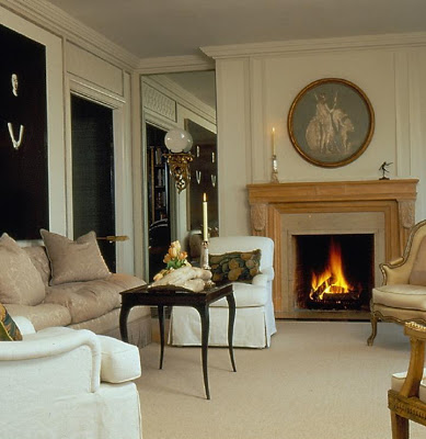
In another of ODA's San Francisco homes, he strays from his modernist leanings and cocoons in a 1913 Beaux Arts building on Russian Hill. The monochromatic color scheme with touches of black and warm woods creates a cleaner more tailored traditonalism, however. Here ODA reveals in his love of classic forms, but still he brings in the unexpected modern twist: the painting of two Korean sisters above the sofa by Lordan Bunch.
Photo: John Vaughan for Architectural Digest
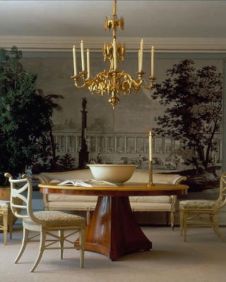
In this Russian Hill Dining Room, ODA has used his own design for the Dining Table. He has placed a gilded Austrian Beidermeier chandelier above and Italian Neoclassic chairs circa 1860 from Ed Hardy Antiques. The white bowl is an item you will see again and again in an ODA interior. It seems to embody a richness in it's traditonal classic form and simplicity that speaks of the designer's aesthetic. Note that it is also on the white lacquer table in the photo of the St. Francis Wood Living Room above. When you get your own copy of this wonderful book, take a moment and search through all of the photos to find it. Always beautiful.
Photo: John Vaughan
In the study of the Russian Hill house you will see the chairs used in Dining Room of the St. Francis Wood house. Ebonized floors and green silk upholstered walls provide drama in a room with little light ,transforming it into a media and evening entertaining room.
Photo: Jeremy Samuelson
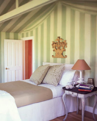
Mr. Diaz-Azcuy makes another style departure in his Sonoma weekend cottage. Far from the madding city crowd, in fact quite remote, he created a country retreat, but one with a "sophisticated and polished look". The tiny bedroom above was given drama with green striped painted tenting. The simple linen upholstered bed is a quiet backdrop to the gilded architectural fragment and the antique Swedish table.
One can see from Mr. Diaz Azcuy's own homes the breadth of his skill and style. It is not a huge leap for him to create interiors for clients in the same vein:
Photo: David Duncan Livingston
The clients lucky to own this home are long time friends of ODA and the trust between designer and client is evident. As said by ODA: "This is one of the few clients who understands the patina of age, and the beauty of of antiques, textiles and objects that show signs of time, and fine craftsmanship. ....... They totally understand that the new house benefits from a mix of venerable antiques and custom-made new peices." Oh, that we all had clients like these in abundance!!
Photo: David Duncan Livingston
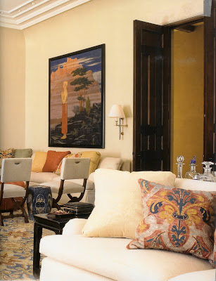
The living room of this house shows a beautiful mix of textiles, furniture peices, art and color. The art deco painting, one of a pair, were the first things acquired for the house. I love the use of a corner banquette. Perfect viewing of the rest of the room! The other photos of this very large room are reason enough to see the whole book!
Photo: David Duncan Livingston
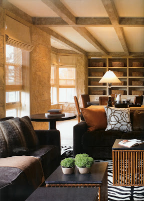
The family room of this client's San Francisco St. Francis Woods home is an example of how ODA can create a modern space that is inviting and liveable for a large family . The warm colors and cozy textures just call one to sit and relax. Note the matching storage bins in the book shelves for toys and games keep it serene and restful, yet friendly for the kids. The tables are by ODA for McGuire.
Photo: Tim Street Porter
From casual and cozy, to city sophistication, ODA seems to be able to handle any type of design challenge. You can see the Bertoia Sculpture on the gilded table in this Pacific Heights living room that was pictured ealier on. Fortuny Silk on the pillows. Beautiful.
Photo: Grey Crawford
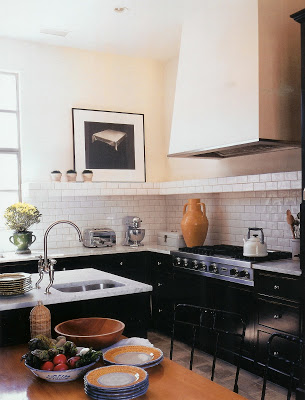
I simply love this Napa Valley kitchen. It has all of the elements one sees often enough: black cabinets, Carrera marble counters, classic subway tile. But the way in which the elements are brought together are somehow unique and more interesting than the usual. Perhaps it is the shelf created out of the tiles, the black and white photo,the metal window frame, the overscaled accessories....whatever it is, it works for me.
Photo: Tim Street Porter
This home, located near the Golden Gate bridge above the Pacific, is a 1920's Spanish Colonial owned by a family with three young children. This home was designed by Greg Stewart, one of the principal partners of ODA Design Associates along with David Aldroyd (both of whom joined the company soon after it's inception in 1987). It is clear there is a meeting of the minds when it comes to the design aesthetic at ODA Design Associates. The modern Richard Serra monoprint creates a dynamic foyle for the eighteenth century Spanish chair. Bronze and rakes table by Ingrid Donat.
Photo:Lisa Romerein
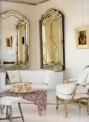
This last room is a collaboration of sorts between Mr. Diaz-Azcuy and clients, architect Andrew Skurman and his wife, sculptor Francoise Skurman. The envelope had been designed by ODA and Skurman more than a decade before for an apartment building. The Skurmans moved in after their realtor notified then it was available. " More than a dozen years old, it still looks startingly fresh" says Skurman. The bedroom sitting area is simply stunning. The combination of the Venetian mirrors, "Fresh Fat" plastic table by London designer Tom Dixon, white leather Odin settee by Konstantin Grcic, and antique turned leg stool is magic.
So....have I tempted you? The book is beautifuly written.... every page keeps your attention. This is something I have simply come to expect from books put together by Diane Dorrans Saeks. She has a way of engaging the reader which I enjoy so much. As I mentioned in this post about Santa Barbara Living, Ms. Dorrans Saeks takes obvious pleasure in speaking with people...all kinds of people. So it is small wonder she is able speak of them in the same real and enthusiastic way.
I have only hit the tip of the iceburg here. There are so many more wonderful homes, beautifully photographed and chronicled. And the multiple office spaces of ODA Design Associates are also pictured. Of course, I didn't want to give too much away! You will want to curl up and enjoy this book for yourselves.
Another home run from Rizzoli! Many thanks!
Available in bookstores ( and the Katiedid Bookshop link in the sidebar!) this May. Keep an eye out. You will be glad you did!
