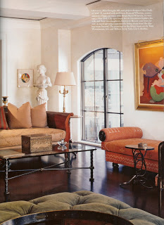
Mica Ertegun: MAC Attack!
I was happy to see a MAC II interior that I just love. Mica Ertegun (head of MACII) always seems to pull together interesting objects and antiques while infusing a space with a modern sensibility. Loving the mix here:
This apartment is on the corner of Fifth Avenue and 59th in Manhattan with views that are just amazing. There is much made in the article about the location being very unique and I'd agree. I am not quite convinced that people can't see right in as is claimed, and there are no window coverings that I can see in some of the rooms. How would you all feel about that, a little overexposed? Just wondering.
Fantastic Dining Room: glamorous, interesting, beautiful.
This is not the Master Bedroom, which is gi-normous. But I liked this more intimate "Guest" room (would not mind being a guest in THIS room!). (Thinking of you Courtney: the elephant fabric is soooo fun.) I was looking for the source for the fabric, but it seems that Arch Digest is just a teensy bit stingy when it comes to sharing info. Anyone seen this before? I would love to find it.
Bottom line: pick up the February Architectural Digest. There is more than one great editorial this month.
If you keep this kind of thing up, AD, you may just win back a new audience! Nice.
Photos: Architectural Digest, February 2008, Photography: Durston Saylor


